Graphics from graphs
In my studies, I encountered some images, and I wanted to explore them. I wanted to check the colors of pixels, to tweak parameters and see what happened. The textbook didn't offer that feature, so I took matters into my own hands.
I reverse-engineered the images into an inspectable, tweakable form. I paced back and forth for a while and discovered the UI that each image deserved, then built it.
As I created multiple images and untangled what they had in common, it became clearer and clearer what I was actually doing: creating 3D graphs and using color as the third dimension.
This got me thinking: is it really this difficult to create images by creating graphs? What general-purpose tool could have created these images? The problem with the explorable images on this page is that they took too long to create. Students and scientists need to spend their time thinking about their domain, not about optimizing an HTML canvas's inner loop.
I haven't found the answer. I don't have a general-purpose tool to show you. But I'll show you the explorable images, and I'll show some very early sketches of the tool that I wish existed.
Background: Gratings in visual perception
Optical illusions are an important part of the science of visual perception. Each illusion is a hint into how the brain works. It's a bit of evidence that we can use to figure out what's going on behind the scene.
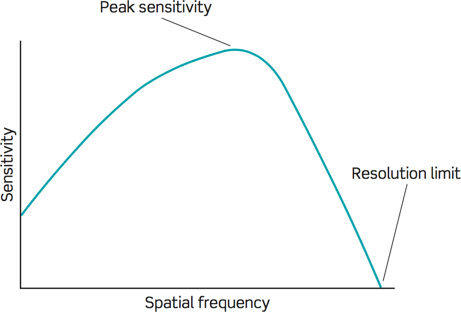
Spatial frequency has taken hold as a primitive in vision theory. Here, play with this:
That's spatial frequency.
When you move your eyes, you rotate them a certain number of degrees. In vision science, spatial frequency is measured in cycles per degree of the visual field.
Part of the reason spatial frequency gets a lot of air time is because we've shown its profound relevance via optical illusions.
Copied below: Some illustrations and descriptions from the original 1974 Scientific American paper and from a recent textbook.
Grating with harmonics
Here's a set of images and descriptions from a Scientific American paper. I split the images and descriptions into a more comic-book form.
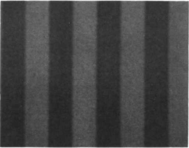
GRATING PATTERNS shown here are photographs of patterns produced on the screen of a cathode ray tube by a voltage-modulating generator.
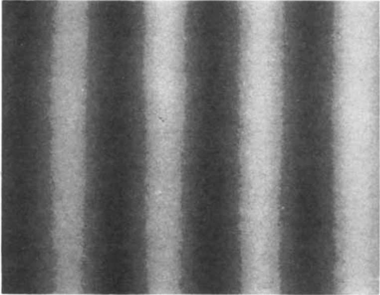
A simple grating is produced by a single sine wave signal from the voltage generator. The brightness of each vertical bar in this simple grating varies in a sinusoidal manner in the horizontal direction across the pattern.
A more complex grating is formed by the addition of the third harmonic of the fundamental sine wave. The third harmonic has three times the frequency and a third of the amplitude of the fundamental wave.
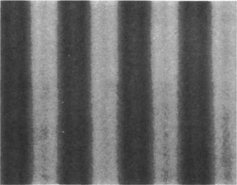
As the frequency of the light and dark bands increases with the addition of...
the fifth harmonic,
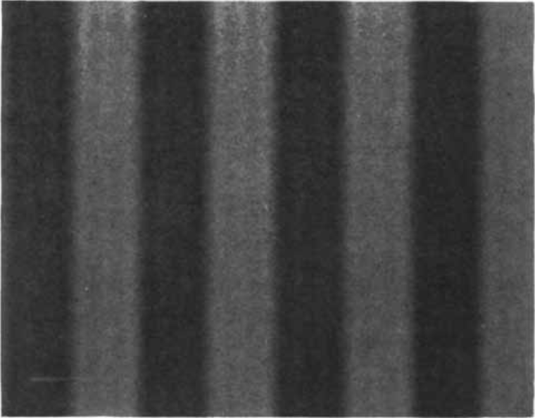
the seventh,
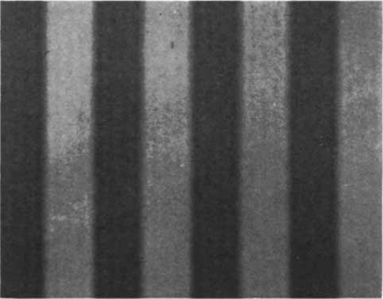
and the ninth,
the individual bands formed by the harmonics become progressively more difficult to see.
With the addition of the 15th harmonic only a square-wave pattern is perceived.
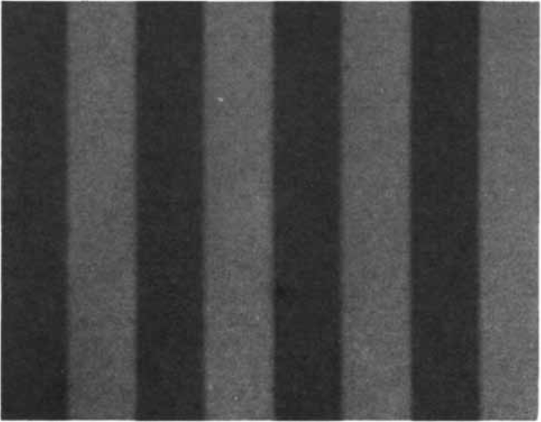
Studies of contrast perception with simple and complex grating patterns such as these indicate that the visual system possesses a number of separate "channels," each spatial tuned to detect a relatively narrow range of spatial frequencies and each with its own range of sensitivity to contrast.
Source: Campwell, F.W. and Maffei, L. (1974). Contrast and spatial frequency. Scientific American 231, 106-13
Sweep grating
Here's another image from the 1974 Scientific American paper:
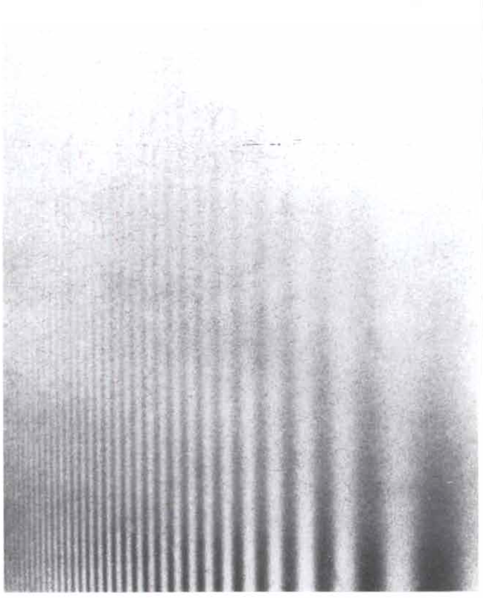
SINUSOIDAL GRATING with a logarithmic variation in spatial frequency and in contrast demonstrates the loss of contrast sensitivity at low and high spatial frequencies. The contrast decreases from the bottom to the top, but at any one height it is the same for all spatial frequencies. When the grating is viewed, it is apparent that the intermediate spatial frequencies are visible to much lower contrast than either the low or the high spatial frequencies.
Source: Campwell, F.W. and Maffei, L. (1974). Contrast and spatial frequency. Scientific American 231, 106-13
This image was printed to a magazine in 1974 and then scanned back into a computer, so it's hard to say how similar it is to the original. A cleaner version can be seen in recent textbooks:
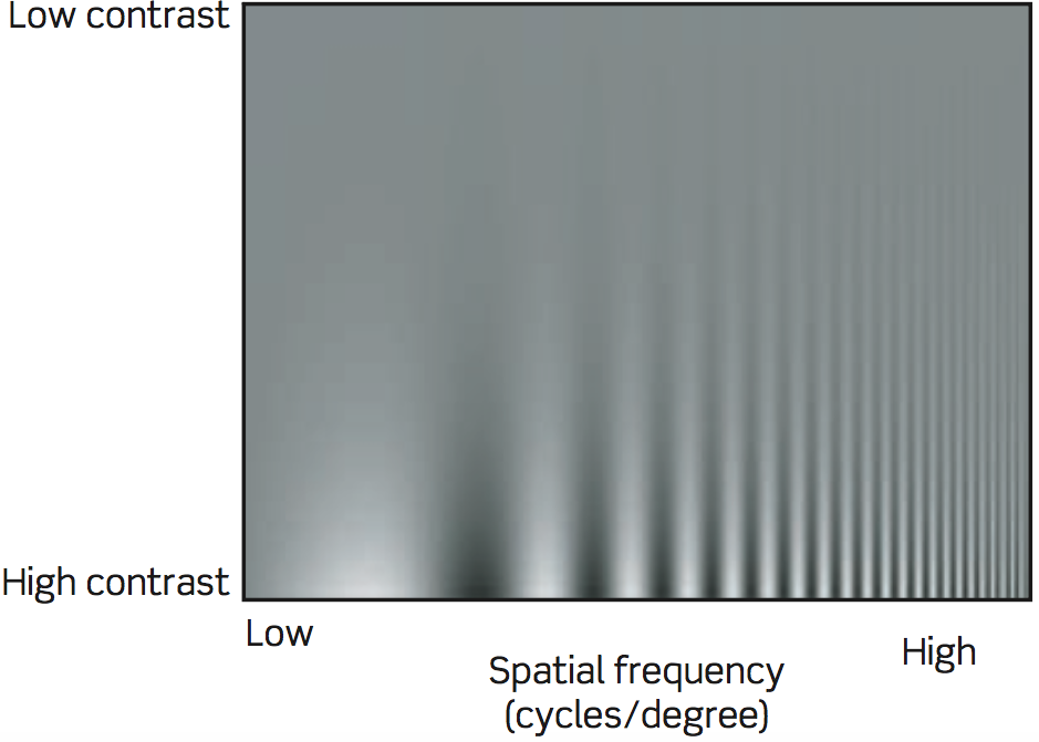
Contrast sensitivity at various spatial frequencies. The spatial frequency of this grating increases from low at the left to high at the right, and the contrast increases from top to bottom. Clearly, we are most sensitive to some middle spatial frequency, with lower sensitivity to both high and low spatial frequencies.
Source: Basic Vision, Snowden, Thompson, Troscianko, Oxford University Press 2012
But to really convince yourself of this effect, you need to be able to inspect the image. You can't just take the author's word for it. They tell you that what you see is an illusion, but is it really? Is spatial frequency really the thing responsible for these effects?
Explorable images
This is where I step in.
These "explorable images" are a special case of explorable explanations. This ought to become the new normal for publications.
Grating with harmonics
Sweep grating
Drag and inspect
Drag an image from your computer to inspect its color and rows.
Breaking down the knobs
Here are some design notes. I like clear thinking, and I think I have some to share.
Let's call this an "explorable fixed algorithm".
I stole this from Bret Victor. I even used his slider PNGs. Thanks, Bret!
These can be wonderfully tweakable. But they're also fixed -- you can't add and remove steps from the algorithm. The author has to anticipate all the fruitful knobs and levers. Solving this limitation is mostly out of scope for this essay.
Within these algorithms we choose numbers, we transform numbers, and we translate numbers into colors. In the harmonic grating, I packed "choose numbers" and "transform numbers" into one step, whereas in the sweep grating, I lumped "transform numbers" in with "translate into colors".
Choosing numbers
In the sweep grating, we choose a number for each column of pixels.
The explorable algorithm lets you choose the type of wave, and it lets you vary the wave's period over space. The wave is shown in the background so that you can see what you're doing.
On the varying period, I give myself an A. It's easy to comprehend, and it's very flexible. You choose two endpoints, and you adjust a Cubic Bézier curve to choose the interpolation between these endpoints (i.e. the easing function). Here's why this is so good: it breaks free of math. You're no longer bound by the world of equations. You're manipulating a visual thing by using a visual thing.
On the wave picker, I give myself a C, for predictable reasons. There's an infinite number of ways to oscillate between -1 and 1, and I provided... 4 options? A better design would offer a "cycle this Bézier curve" option.
Choosing + transforming numbers
In the grating with harmonics, we choose a number for each column of pixels, then choose another and compute the sum, and so on. It's an imperative loop.
These numbers are mostly visualized. Each wave is in the background, and the resulting wave is in the foreground.
My favorite part is the editable number list. Play with it! The visualization updates as you type. See what happens with "1 2 3 4 5".
There are some obvious missing features. The "1/n" should be tweakable. Similar to above, "choose one of these 4 waves" is limiting. And if we want to get really crazy: what if I want to combine different types of wave?
Translating numbers into color
In the grating with harmonics, we simply translate each number into color using a tweakable legend.
The color knobs are adjustable. You can move them, and you can change their color. You create a linear gradient, and the legend extrapolates this gradient past the knobs.
The color knobs use your browser's built-in color picker, or fall back to a live-updating text input.
One critique: this legend doesn't warn you when you create invalid colors. When it extrapolates past the knob, it will happily choose an RGB value outside of the [0, 255] range. Browsers will quietly convert this number to the appropriate boundary.
Transforming numbers + translating into color
In the sweep grating, we use the previously-selected per-column number, we damp it toward 0 according to its pixel row, and we translate it into color.
Another way to think of this: we apply a varying legend to the numbers that we chose. The legend varies by row.
To help you see what you're doing, I show little thingies that I call "feature trackers".
[I'm still writing!]